


A Space Between Seeing and Reading
Why do artists use semi-legible text in their work?


As part of my ongoing quest to figure out what I am doing when I make art, I’m taking us back to my very first post, where I discussed “adding the words,” in two senses – using written text in my ink paintings, and using this newsletter to dig a little deeper.
This post, which is based on a recent talk I gave, will not dwell on my own paintings. You can read about my technique here and see my currently available work here. This one is less about making and more about figuring out what my work is attempting to do and where it fits.
When I started making layered ink paintings, I wasn’t much aware of other artists using semi-legible text, but I’ve since discovered others incorporating the written word in visual art in a variety of ways – scribbled, smudged, typed over – that hinder the viewer from reading it easily. In studying these works, I was struck by how artists are doing versions of the same thing for very different reasons. A few examples:
Glenn Ligon: Communicating the Failure to Communicate
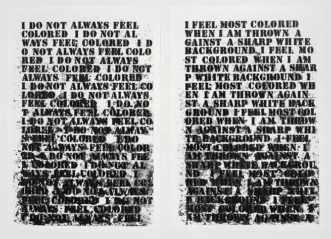
Ligon, a Black, queer artist, confronts otherness in his work. In this piece, he begins with a phrase from a Zora Neale Hurston essay – “I do not always feel colored” - and repeats it over and over, making the words gradually messier and less legible, until they are all but unreadable.
Ligon explains: “Cultural translation, like any other translation, is always involved with loss, the untranslatable, excess meanings, the indecipherable. Given the cultural context the literature and photos I am using comes out of, the demands on those texts and images, I am interested in when they fail to communicate, the space that is opened up by not communicating.”
The transition from clarity to illegibility is important to Ligon: “It makes the words cast shadows, bleed into one another, [so that] their meanings seem less fixed. The smearing also creates a visual interaction with the gesso ground, a metaphor for the interaction between blacks and whites in the construction of racial identity.” (link)
Julia Bloom: Concealing Thoughts Too Personal to Share


Washington, DC-based artist Julia Bloom makes drawings where she creates visual patterns with typed words and geometric shapes. She likens these pieces to diary entries: beginning in 2020, she typed out reactions to anxiety-provoking events - the pandemic, racial unrest, the US election – along with more mundane details of her life. Bloom began by leaving the words legible but says that she “felt vulnerable about putting those words out in the world” and “wanted to hide a little bit,” so she began overtyping the lines to make them harder to read.
Bloom says that her drawings attract two distinct camps of viewers: people who will try to read them, often for a long time, and people who find the work visually overwhelming and won’t even try. (In contrast, I find that almost everyone tries to read my layered text paintings, and are very pleased with themselves when they decipher the words)
EJ Hauser: Words as Visual Information, Fast and Slow


New York artist Hauser often uses words, usually combined with abstract images, in their work. The artist says that, both visually and conceptually, the form of the letters is just as important as what they say.
Writer Megan Liu Kincheloe notes that “Hauser appreciates letters as images, geometric propositions, and agreed upon sign systems. Text is often the most accessible part of the paintings, but the speed of word recognition is so instantaneous as to interfere with looking beyond the text into the pools of amorphous drawing that require slower viewing to emerge.”
These two paintings from the “Forget-Me-Not” series illustrate this dynamic well – the same written text is presented first in a bright, high-contrast, clearly legible style, over enigmatic images that take longer to emerge, and then in a white-on-white, low-contrast style almost completely lost behind dramatic, arresting dark forms. In both cases, the viewer must take time to absorb the information coming from the words, the shapes, and their starkly different juxtapositions.


I could give many more examples: Adam Pendleton’s densely layered “Black Dada” works, Cy Twombly’s scribbled and scratched-out lines of history and poetry, and Mark Bradford’s stratified and sanded-down collages, to name a few. All have different qualities and intentions, but they share a common effect: to bring the viewer into a space between seeing and reading.
Whether or not we can truly linger in that space, using different perceptual processes simultaneously, is perhaps a question for science. Can humans really absorb images and read words at the same time? Or are we just switching back and forth rapidly? I’m not sure we have an answer yet.
One thing seems clear, however: in visual art, a written text does not have to be perfectly legible to deliver a powerful message.
If you like this post, please share it! You can also support my work by buying my art.
I loved this examination and I also use text at various levels of legibility in my work. Sometimes I like the directness of language but also that language despite its pure semantic form can be used to divert and obfuscate. I love Twombly’s work and other folks like Gysin that use asemic writing (like Tim’s phenomenal glyphs work) to remove reading from language and explore marks that evoke our brains’ need to understand. It’s similar to my fascination with palimpsest forms — a surface that refuses to hold only a single history but stacks and blends them.
Great post. I go back and forth about how text is used in artwork and my reactions vary depending on how text and other elements are used. It definitely gets murkier and sometimes more interesting when an artist fuses text and other imagery to the point of near or total illegibility, like Glen Ligon and even some of your works, like the one posted here.
Most often, the more clear the text is, the more I think I'm supposed to focus on the meaning(s) whether straight forward or implied. The more indistinct text is, the more metaphorical I'll think of it relative to other imagery present, how color is used or other elements.
The funny thing for me is that I began my use of what I call "glyphs" in my work as a way to reference writing and written communication in my work, but not have recognizable text. I wanted to stay away from possible easy readings of my work, if it were text-based. For my work, I wanted the glyphs to function more as drawing and form than to elicit any near instant recognition of meanings in the viewer. This isn't to say that I think text-based work is "easy" or somehow less complicated than what I do, I simply haven't seen how actual text will be of any use in what I do. I definitely applaud those that do use it and use it well.